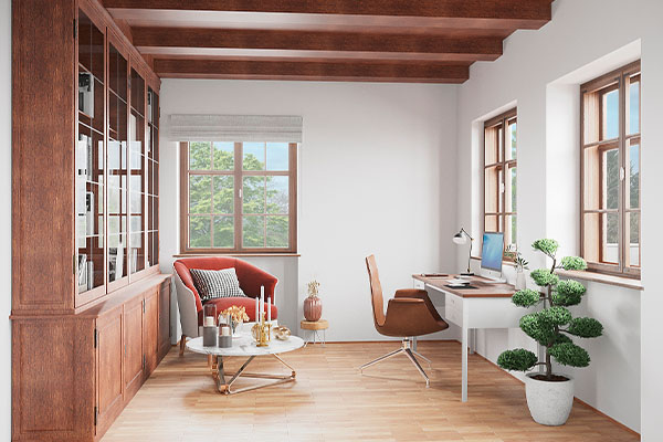
Mixing different LVT Colors for office zoning is a strategic design technique that uses contrasting floor finishes to define functional areas without physical barriers. Many commercial office layouts suffer from a monotonous “sea of gray” that contributes to employee fatigue and spatial confusion. Without clear visual boundaries, collaborative zones bleed into quiet areas, disrupting workflow and diminishing the professional atmosphere you strive to maintain. By mastering the art of the inlay, you can transform these uninspired spaces into high-functioning environments that guide movement and boost morale.
Why Is Visual Zoning Essential for Modern Office Productivity?
Visual zoning is essential because it provides intuitive cues that guide employee behavior and movement throughout an open-plan office. Utilizing a variety of LVT Colors allows you to differentiate between high-energy collaboration hubs and low-distraction deep-work zones. This spatial clarity reduces the cognitive load on staff, allowing them to transition between tasks more seamlessly.
When you eliminate the need for permanent walls, you create a sense of openness that traditional partitioning simply cannot match. This approach maximizes natural light and improves air circulation, both of which are critical factors for long-term health and focus. Strategic flooring design ensures that every square meter of your office serves a specific, recognizable purpose.
Defining “Zoning” in the Open-Plan Era
The open-plan era demands a more sophisticated approach to space management than just rows of desks. Here is the deal: zoning is about creating “rooms without walls” by changing textures and colors underfoot. You can use these transitions to signal where one department ends and another begins. This subtle boundary-making respects the flow of the office while maintaining structural order.
How Can Flooring Replace Bulky Physical Dividers?
Traditional partitions are often expensive, inflexible, and block valuable sightlines across the floor plate. Why does this matter? By using flooring inlays, you achieve the same organizational benefits without the physical clutter or high renovation costs.
- Cost Efficiency: Avoids the expense of building and maintaining drywalls.
- Flexibility: Allows for easier furniture reconfiguration as teams grow.
- Aesthetics: Creates a modern, high-end look that impresses clients and talent.
- Lighting: Preserves the path of natural light from windows to the building core.
Key Takeaway: Strategic flooring transitions define space usage intuitively, fostering a more organized and psychologically comfortable work environment.
| Zoning Benefit | Impact on Productivity | Long-term Value | |
|---|---|---|---|
| Acoustic Separation | High (Reduces noise distractions) | Excellent | |
| Visual Wayfinding | Medium (Speeds up navigation) | Good | |
| Psychological Boundaries | High (Encourages focus) | Premium |
This analysis confirms that visual zoning serves as a cost-effective alternative to architectural interventions while significantly improving the daily user experience.
How Should You Choose Your Primary and Accent LVT Colors?
You should choose your primary and accent LVT Colors based on a balance of brand identity, existing architecture, and the intended energy of each specific zone. A well-designed office typically utilizes a neutral “field” color to provide a cohesive base across the entire floor. From there, you introduce accent colors to highlight specific features like reception desks, breakroom islands, or internal meeting pods.
Selecting the right palette requires an understanding of how colors interact under various lighting conditions throughout the day. You must ensure that your accent colors offer enough contrast to be functional but remain within a harmonious family to avoid a disjointed appearance. This careful selection process ensures that your office feels curated rather than cluttered.
Balancing Neutral Bases with Bold Highlights
The foundation of any successful inlay design is a versatile neutral base that can ground the more vibrant elements of the room. Here is the deal: if your base is too busy, your accents will lose their impact and the space will feel chaotic. Use light grays or warm beiges for general circulation paths to keep the environment feeling airy. Bold highlights should be reserved for areas where you want to draw the eye or stimulate activity.
Understanding the LRV (Light Reflectance Value) of Different LVT Colors
Light Reflectance Value, or LRV, measures how much light a color reflects versus absorbs. Why does this matter? Choosing LVT Colors with significantly different LRVs creates a high-contrast boundary that is easy for the eye to track. This is particularly important for meeting accessibility standards and ensuring that level changes or transitions are visible to all users.
- High LRV (70+): Best for small rooms or areas with limited natural light.
- Medium LRV (30-60): Ideal for general office flooring to hide scuffs.
- Low LRV (0-20): Perfect for “anchor” zones like executive lounges.
Key Takeaway: Selecting high-contrast LVT Colors ensures that zones are visually distinct while maintaining a cohesive professional palette.
| Color Category | Recommended Use Case | Visual Effect | |
|---|---|---|---|
| Warm Wood Tones | Breakrooms / Social Hubs | Comforting & Welcoming | |
| Cool Stone Grays | Workstations / Hallways | Professional & Focused | |
| Vibrant Accents | Idea Labs / Entryways | Creative & Energetic |
Choosing colors with a strategic eye toward LRV and emotional impact ensures that your flooring does more than just cover the subfloor; it actively shapes the workplace culture.
What Are the Most Effective Inlay Techniques for Seamless Transitions?
The most effective inlay techniques involve precision-cutting LVT planks to create flush transitions that require no T-moldings or unsightly transition strips. Utilizing a variety of LVT Colors allows you to create curved pathways or sharp geometric “rugs” built directly into the floor. This level of craftsmanship ensures a premium finish that is as safe as it is beautiful.
When you use flush inlays, you eliminate the trip hazards often associated with mixing different flooring materials like carpet and vinyl. The result is a continuous, level surface that allows office chairs and equipment to roll effortlessly between zones. Achieving this requires a high-quality product with consistent thickness and square edges.
The Precision of Flush Inlays vs. Transition Strips
A flush inlay is the gold standard for high-end commercial office design because it creates a unified surface. Here is the deal: transition strips often collect dirt and can come loose over time in high-traffic areas. By choosing planks of the same thickness, you can butt different colors directly against one another. This technique creates a bespoke look that signals quality and attention to detail.
Creating Geometric Patterns to Anchor Furniture
Using geometric inlays is a powerful way to define specific furniture groupings, such as a large conference table or a set of lounge chairs. Why does this matter? It creates a visual “anchor” that keeps the furniture from feeling like it is floating in a vast, empty space. You can use hexagons, triangles, or simple rectangles to frame these important office assets.
Why Material Thickness Matters for Level Surfaces
When mixing different LVT Colors, you must verify that every product in the design shares the exact same overall thickness. If one color is even a millimeter thicker than the rest, you will face installation challenges and potential safety risks. Professional designers always specify products from the same manufacturer and series to guarantee compatibility.
- Consistency: Always source from a single production line for perfect height matching.
- Wear Layer: Ensure all colors have a 20mil (0.5mm) or higher wear layer for commercial use.
- Expansion: Match the core material (e.g., all dry-back or all loose-lay) to ensure even expansion.
Key Takeaway: Mastering inlay techniques allows for smooth, trip-free transitions between different zones even when using complex shapes.
| Technique | Difficulty | Best For | |
|---|---|---|---|
| Straight Joint | Low | Simple departmental borders | |
| Geometric Inlay | Medium | Framing furniture / Meeting rooms | |
| Curved Wave | High | Wayfinding / Creative hallways |
Seamless transitions are the hallmark of professional installation, providing a sophisticated aesthetic that enhances the overall architectural value of the office.
Can Different LVT Colors Influence Employee Mood and Focus?
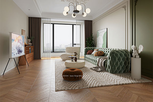
Yes, the psychological impact of different LVT Colors can significantly alter how employees feel and perform in their specific work environments. Research in color psychology suggests that blues and greens can foster a sense of calm and concentration, making them ideal for deep-work areas. Conversely, warmer tones like oranges or light woods can stimulate conversation and creativity in collaborative spaces.
By zoning your office with color, you provide “sensory signals” that help employees mentally switch gears as they move through the building. A bright, high-energy breakroom can help staff recharge during lunch, while a neutral-toned workstation area minimizes visual distractions. This holistic approach to design supports mental well-being and long-term engagement.
The Science of Color Psychology in Workstations
Workstations require a balance between professionalism and comfort to sustain eight hours of focus. Here is the deal: overly vibrant floors in desk areas can lead to eye strain and restlessness. Most designers opt for muted grays or subtle wood grains in these zones to create a stable, non-distracting foundation for daily tasks.
Energizing Breakrooms vs. Calming Concentration Pods
In common areas, you have more freedom to experiment with bold palettes that reflect your company’s energy. Why does this matter? A vibrant floor in a cafeteria can foster a social atmosphere that encourages team bonding. In contrast, “quiet pods” or library zones benefit from darker, grounding colors that suggest a “hush” and promote introspection.
- Blue/Green: Best for focus and stress reduction.
- Yellow/Orange: Best for brainstorming and social interaction.
- Earth Tones: Best for relaxation and comfort in lounge areas.
- Light Gray/White: Best for cleanliness and modern minimalism in labs.
Key Takeaway: Color-coded zoning acts as a silent cue for behavior, signaling areas for high-energy collaboration or quiet deep work.
| Zone Type | Recommended Color Group | Psychological Goal | |
|---|---|---|---|
| Focus Zone | Cool Neutrals / Blues | Mental Clarity | |
| Collaboration Hub | Warm Woods / Accents | Creative Spark | |
| Wellness Room | Soft Greens / Tans | Stress Recovery |
Using psychology to drive your flooring choices ensures that the office environment works for the people, rather than the people working against the environment.
How Does Floor Zoning Improve Office Wayfinding and Safety?
Floor zoning improves office wayfinding by providing a permanent, floor-based map that naturally directs visitors and staff toward key destinations. By using contrasting LVT Colors for hallways and circulation paths, you create a “yellow brick road” effect that is intuitive to follow. This is especially helpful in large, complex floor plans where traditional signage might be overlooked.
Beyond convenience, visual zoning also plays a critical role in safety by highlighting potential hazards or emergency routes. You can use high-visibility inlays to mark the perimeter of fire exits, first aid stations, or electrical panels. These visual cues remain effective even in low-light situations or high-stress environments, providing an extra layer of protection for everyone in the building.
Mapping Natural Pathways with Contrasting Textures
Navigation should feel effortless for anyone entering your facility for the first time. Here is the deal: a change in floor color can guide a visitor from the reception desk directly to the guest lounge without a single word being spoken. This “invisible hand” approach to design makes the office feel welcoming and professionally organized.
High-Visibility Inlays for Emergency Exits and Reception Areas
Safety and first impressions often happen at the floor level. Why does this matter? A distinct color change at the threshold of a reception area creates a sense of arrival. Similarly, using a bright or high-contrast border around emergency equipment ensures that these vital tools are never blocked by furniture or clutter.
- Pathways: Use long, continuous strips of a different color to indicate main corridors.
- Thresholds: Change color at doorway entrances to signal a transition in privacy level.
- Safety Zones: Use bold borders around fire extinguishers or AED cabinets.
Key Takeaway: Directional inlays reduce cognitive load for visitors and staff by providing clear, floor-based navigation cues.
| Wayfinding Element | Color Strategy | Navigation Benefit | |
|---|---|---|---|
| Main Corridor | High-contrast linear inlay | Directs flow through the building | |
| Department Entry | Subtle texture/color shift | Signals “ownership” of the space | |
| Safety Perimeter | Bright accent border | Keeps emergency access clear |
An office that navigates itself is an office that works better for everyone, reducing the time spent searching for rooms and increasing time spent on productive tasks.
Why Is Commercial-Grade LVT the Best Choice for High-Traffic Inlays?
Commercial-grade LVT is the best choice for inlays because it offers the perfect balance of design flexibility and industrial-strength durability. Unlike standard residential products, high-performance LVT is engineered with a thick wear layer that can withstand the constant friction of rolling office chairs. This ensures that the intricate edges of your LVT Colors design remain crisp and beautiful for years.
Furthermore, commercial LVT provides superior dimensional stability, which is crucial for complex inlay patterns. In environments with temperature fluctuations, lesser materials might expand or contract, causing the gaps between your colorful inlays to open up. Commercial-grade planks are reinforced with fiberglass or rigid cores to ensure they stay exactly where they were installed.
Comparing Durability: Why Adasea’s LVT Outlasts the Rest
Not all luxury vinyl is created equal, especially when it comes to the demands of a busy office. Here is the deal: Adasea’s products are tested against rigorous international standards for abrasion and impact resistance. When you invest in a professional-grade product, you are buying a floor that won’t show “walk-paths” in the color transitions after just a few months of use.
The Secret to Long-Lasting Glue-Down Inlay Performance
For the most complex inlay designs, a glue-down installation is almost always recommended over a click-lock system. Why does this matter? Glue-down LVT allows for much more intricate cuts and ensures that even small, decorative pieces stay permanently bonded to the subfloor. This method also provides better acoustic performance, which is vital in an office setting.
- Wear Layer: A 0.55mm (22mil) wear layer is standard for high-traffic office corridors.
- UV Coating: Protects the vibrant colors from fading near large windows.
- Stain Resistance: Ensures coffee spills in the breakroom don’t ruin the inlay art.
Key Takeaway: High-performance LVT, such as Adasea’s Commercial-Grade LVT, ensures that intricate inlay designs withstand the rigors of heavy office foot traffic.
| Feature | Residential LVT | Commercial-Grade LVT | |
|---|---|---|---|
| Wear Layer | 6mil – 12mil | 20mil – 28mil | |
| Warranty | Limited Life | 10-15 Year Commercial | |
| Inlay Capability | Low (Click systems) | High (Glue-down systems) |
By choosing a commercial-grade product, you protect your design investment and ensure that the office remains looking new through years of heavy occupancy.
What Design Patterns Best Highlight a Mix of LVT Colors?
The pattern you choose for your inlay can be just as impactful as the LVT Colors themselves. Popular choices include herringbone, chevron, and staggered plank patterns, each of which can be used to direct the eye in different ways. For example, a herringbone pattern in a hallway can create a sense of movement, while a large-scale tile pattern in a lobby suggests stability and grandeur.
You can also use “gradient” patterns where one color slowly transitions into another across a wide area. This effect is achieved by interspersing planks of two different colors in a randomized fashion. This technique is perfect for creating soft, organic borders between zones that don’t feel too rigid or “corporate.”
Herringbone and Chevron: Classic Meets Modern Zoning
Herringbone patterns are incredibly effective for creating a “high-end” feel in executive areas. Here is the deal: when you mix two or three shades of wood-look LVT in a herringbone layout, you create a rich, textured surface that hides dirt and wear exceptionally well. It is a timeless look that bridges the gap between traditional craftsmanship and modern material science.
Using Gradient Transitions for a Subtle Boundary Effect
If you want to avoid harsh lines in your office, a gradient transition is your best friend. Why does this matter? It mimics the natural flow of human activity, where collaboration and individual work often overlap. By slowly fading from a dark “focus” color to a light “social” color, you create a space that feels fluid and adaptable.
- Herringbone: Adds sophistication and visual interest to boardrooms.
- Staggered Plank: Best for making narrow hallways feel wider.
- Modular Squares: Ideal for creating a “carpet tile” look with the benefits of vinyl.
- Hexagon Inlays: Perfect for modern, playful breakrooms and creative studios.
Key Takeaway: Pattern selection is just as important as color; the right layout can elongate a hallway or make a small meeting room feel expansive.
| Pattern Type | Visual Vibe | Best Zone | |
|---|---|---|---|
| Herringbone | Classic / Formal | CEO Office / Boardroom | |
| Random Mix | Modern / Casual | Breakroom / Kitchen | |
| Linear Border | Structured / Orderly | Hallways / Wayfinding |
The right pattern acts as the “language” of your floor, communicating the energy and purpose of the space to everyone who walks across it.
How Do You Ensure a Level Surface When Mixing Multiple LVT Planks?
Ensuring a level surface when mixing different LVT Colors starts with meticulous subfloor preparation and a commitment to precision during installation. Even the most beautiful color design will fail if the planks are not flush, as small lips (lippage) can cause premature wear and tripping hazards. You must ensure the subfloor is smooth, dry, and perfectly flat before the first plank is ever laid.
Furthermore, you must account for the expansion and contraction of the material. While LVT is much more stable than natural wood, it still reacts to environmental changes. Using a high-quality commercial adhesive and following the manufacturer’s acclimation guidelines are non-negotiable steps for a successful multi-color installation.
The Importance of Precise Subfloor Preparation
The floor is only as good as what lies beneath it. Here is the deal: any bump in the concrete will be magnified once you start doing intricate inlay work. A self-leveling underlayment is often the best insurance policy for a complex office zoning project. It provides the “blank canvas” necessary for your flooring art to shine.
Why Professional Installation is Crucial for Complex Inlays
While DIY is fine for a guest bedroom, complex commercial inlays require a seasoned professional. Why does this matter? Cutting curved inlays or intricate geometric patterns requires specialized tools and years of experience. A professional installer knows how to hide seams and ensure that the different colors transition with microscopic precision.
- Acclimation: Let the material sit in the office for 48 hours to reach ambient temperature.
- Adhesive Choice: Use a pressure-sensitive adhesive designed for commercial vinyl.
- Roller Use: Always use a 100lb roller after installation to ensure 100% bond.
Key Takeaway: Successful zoning requires technical precision to ensure that different LVT Colors and planks sit perfectly flush, maintaining safety and aesthetics.
| Installation Step | Importance | Risk of Skipping | |
|---|---|---|---|
| Subfloor Leveling | Critical | Unstable seams / Trip hazards | |
| Material Acclimation | High | Buckling / Gap opening | |
| Rolling the Floor | High | Poor adhesive bond / Planks lifting |
Technical excellence is the foundation of design beauty; without it, even the best color palette will lose its luster over time.
Is Mixing LVT Colors More Cost-Effective Than Traditional Partitioning?
Mixing LVT Colors for zoning is significantly more cost-effective than building traditional walls or installing glass partitions. When you use flooring to define space, you avoid the high costs of framing, drywalling, painting, and the subsequent need for revised HVAC and lighting plans. It allows you to achieve a structured layout for a fraction of the capital expenditure required for architectural changes.
Additionally, the long-term maintenance of a zoned LVT floor is much lower than that of painted walls or glass dividers which require constant cleaning and repair. LVT is famously durable and easy to sanitize, making it a “set it and forget it” solution for busy facility managers. When you look at the total cost of ownership, flooring-based zoning is the clear winner for budget-conscious businesses.
Calculating the ROI of Durable Visual Dividers
Every dollar spent on flooring is a dollar that doesn’t have to be spent on temporary office furniture or acoustic panels. Here is the deal: a well-zoned floor can actually increase the “perceived value” of the office space, which is great for attracting top-tier clients and employees. This aesthetic boost contributes to a stronger brand image and better overall workplace satisfaction.
Reducing Long-Term Maintenance Costs in High-Traffic Zones
Unlike carpet, which stains and wears out in “traffic paths,” LVT maintains its color and texture for decades. Why does this matter? In a multi-colored floor, if one section becomes damaged, you can often replace just those specific planks without ripping up the entire room. This modularity makes LVT an incredibly sustainable and cost-effective choice for modern offices.
- Labor Savings: Installation is much faster than traditional construction.
- Tax Benefits: Flooring is often classified as a depreciable asset, unlike permanent walls.
- Operational Continuity: You can install LVT in sections overnight, avoiding office downtime.
Key Takeaway: Investing in creative flooring layouts reduces the need for expensive architectural changes while providing a modern, premium aesthetic.
| Cost Element | Traditional Walls | LVT Zoning | |
|---|---|---|---|
| Initial Installation | Very High ($$$) | Low-Medium ($) | |
| Maintenance | High (Paint/Cleaning) | Low (Mop/Sweep) | |
| Flexibility | Zero | High |
By shifting your budget from vertical barriers to horizontal design, you create a more flexible, breathable, and profitable workplace.
What Future Trends Are Shaping the Use of LVT Colors in Workplace Design?
The future of office design is moving toward “biophilic” patterns and flexible, modular layouts that use LVT Colors to mimic the natural world. Designers are increasingly using wood-look and stone-look inlays together to create “indoor gardens” or “river-path” hallways. This connection to nature has been proven to reduce stress and increase creativity among office workers.
We are also seeing a rise in “flex-offices” where the floor plan needs to be reconfigurable at a moment’s notice. In these environments, loose-lay LVT with color-coded zones allows teams to move furniture and “re-zone” their space without calling in a construction crew. This adaptability is the key to surviving in an ever-changing business landscape.
Biophilic Patterns and Natural Wood-Look Inlays
Biophilia is more than just a buzzword; it is a fundamental shift in how we view the human-building relationship. Here is the deal: using earth-toned LVT Colors to create organic shapes on the floor can lower heart rates and improve cognitive function. By mixing a deep oak grain with a soft moss-green vinyl, you bring the outdoors inside.
Modular Reconfigurability for the “Flex-Office”
As businesses grow and shrink, their physical space must be able to keep up. Why does this matter? Modern flooring products are being designed with “interchangeability” in mind. You can swap out a gray “focus” zone for a blue “collaborative” zone in a single weekend, keeping your office fresh and aligned with your current needs.
- Sustainability: Recycled content in LVT is becoming the industry standard.
- Digital Printing: Allows for hyper-realistic custom colors and branding.
- Acoustics: Integrated underlayments are getting better at silencing footsteps.
Key Takeaway: Future-proof office designs leverage the versatility of LVT to create adaptable spaces that can be updated as company needs evolve.
| Future Trend | Visual Driver | Outcome | |
|---|---|---|---|
| Biophilic Design | Nature-inspired colors | Improved mental health | |
| Modular Zoning | Swap-able color sections | Ultimate operational flexibility | |
| Brand Integration | Custom digital colors | Stronger corporate identity |
The art of inlay is only getting more advanced, allowing you to create spaces that are as intelligent as the people who work within them.
Frequently Asked Questions (FAQ)
- Can I mix wood-look and stone-look LVT in the same office?Yes, mixing these textures is one of the most effective ways to distinguish between “warm” lounge areas and “cool” professional meeting spaces. It adds a sophisticated layer of visual interest that a single texture cannot achieve.
- Does mixing different LVT Colors make cleaning more difficult?Not at all. As long as you choose high-quality products like those from Adasea, all colors will share the same maintenance requirements and top-tier wear layer protection.
- Are custom inlays more expensive to install than a single-color floor?It depends on the complexity of the pattern. While labor costs for precision cutting are slightly higher, you often save thousands of dollars by avoiding the need for physical partitions and walls.
- Can I use SPC flooring instead of LVT for zoning?Yes, SPC is excellent for its extreme stability, though traditional glue-down LVT is often preferred for very intricate, curved inlay art due to its slightly higher flexibility during the cutting process.
- How do I match LVT Colors with my company’s branding?We recommend using a neutral base (like gray or oak) for 80% of the floor and using brand-specific accent colors for “hero” zones like the reception area or executive boardroom.
Conclusion
Mastering the art of the inlay is not just about aesthetics; it is about building a smarter, more productive workspace. By strategically mixing LVT Colors, you can define your office culture, guide your team’s movement, and foster a healthy environment—all while saving on construction costs. At Adasea Flooring, we specialize in providing the high-performance, commercial-grade materials you need to bring these complex designs to life. Our vision is to empower distributors and designers to create spaces that inspire through durability and creative freedom. Ready to transform your next office fit-out? Reach out to us today to get a quote and see how our global manufacturing expertise can support your vision.