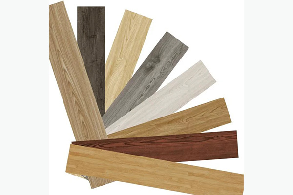
To pick the right floor color, you must balance the room’s natural light levels, total square footage, and desired psychological mood against the specific undertones of your existing wall palette and furniture. Many professionals struggle with the high stakes of choosing a foundation that will remain in place for decades, often fearing that a single color mismatch will diminish the value of the entire property. This anxiety is justified because a floor that is too dark can suffocate a small office, while a floor that is too light might fail to provide the gravitas required for a luxury executive suite. By following a systematic design framework, you can master how to pick floor color to ensure a cohesive, high-end finish that elevates every other element in the room.
Why is lighting a factor in how to pick floor color?
Lighting changes the chemical appearance of pigments on a surface, making it the most critical variable when you determine how to pick floor color. Because light temperature fluctuates throughout the day, a floor that looks warm at noon might appear clinical and cold under evening LED fixtures.
Understanding the interplay between lumens and surface reflection is essential for a professional result. When you analyze how to pick floor color for a specific project, you must account for both natural sun exposure and the Color Rendering Index (CRI) of your interior lamps.
How does natural light change color?
North-facing rooms often receive a cool, bluish light that can make grey or white floors look institutional. Conversely, south-facing rooms are flooded with warm light, which can intensify the orange or red tones in natural wood finishes.
Think about it:
- North light: Enhances cool tones, dulls warm ones.
- South light: Brightens everything, can wash out very light colors.
- East/West light: Creates long shadows and intense warmth during sunrise or sunset.
What is the impact of artificial light?
The Kelvin scale of your light bulbs will significantly alter how a floor’s finish is perceived by the eye. Warm white bulbs (2700K) bring out the richness in oaks and walnuts, while cool white (4000K+) is better suited for modern grey stone aesthetics.
| Light Type | Effect on Floor Color | Best Floor Pairing |
|---|---|---|
| Natural Sun | Reveals true undertones | All colors |
| Warm LED | Enhances yellows/reds | Honey Oak, Walnut |
| Cool LED | Enhances blues/greys | Slate, White Marble |
The choice of lighting dictates whether a floor feels inviting or sterile.
Key Takeaway: Always view your flooring samples at different times of the day and under the specific lighting temperatures of your building to avoid unexpected color shifts.
What room size impacts how to pick floor color?
The physical dimensions of a space dictate whether you should lean toward expansive light shades or grounding dark tones. When considering how to pick floor color for commercial or residential layouts, you must use color as a tool to manipulate the perception of volume.
Light colors generally reflect more light, pushing the boundaries of the room outward to create an airy atmosphere. Darker colors absorb light, pulling the walls inward to create a sense of intimacy and luxury.
Can light floors save small rooms?
For cramped hallways or small offices, light-colored floors are the standard solution for creating the illusion of more square footage. Pale oaks, light greys, and cream tones reduce the visual “weight” of the floor, making the room feel significantly more breathable.
Here is the deal:
- White and beige: Maximum light reflection.
- Light grey: Modern feel without being too stark.
- Natural blonde wood: Adds warmth without closing in the space.
When are dark floors appropriate?
In massive open-plan areas, very light floors can sometimes feel (floating) or lacking a center of gravity. Darker floors provide a “weight” that anchors large furniture pieces and makes a vast hall feel more structured and intentional.
| Room Size | Recommended Tone | Psychological Effect |
|---|---|---|
| Small / Narrow | Light / Pale | Expansive and Airy |
| Large / Open | Medium / Dark | Grounded and Elegant |
| Multi-purpose | Neutral Medium | Balanced and Versatile |
Space perception is a direct result of the light-to-dark ratio between the floor and the ceiling.
Key Takeaway: Use light colors to “open” restricted spaces and reserved dark tones for large, high-ceiling environments where you want to emphasize prestige and comfort.
Which undertones matter for how to pick floor color?
Every floor has a hidden secondary color known as an undertone, which is the most common reason for design “clashes.” Mastering how to pick floor color requires identifying whether a surface is warm (yellow, red, orange), cool (blue, grey, green), or neutral.
If your walls have a cool blue undertone and you install a floor with a warm orange undertone, the space will feel vibrating and unsettled. Consistency in undertones creates the “flow” that defines professional interior design.
How do you identify warm undertones?
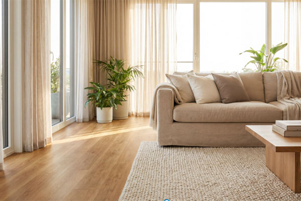
Warm floors typically feature hints of honey, cinnamon, or rich cocoa that evoke a sense of tradition and comfort. These are ideal for hospitality environments or residential living areas where a “cozy” vibe is the primary goal.
Look at the facts:
- Red undertones: Common in cherry and mahogany.
- Yellow undertones: Found in traditional oak and bamboo.
- Orange undertones: Typical of pine and stained hardwoods.
How do you identify cool undertones?
Cool floors often have a base of ash, charcoal, or blue-grey, providing a sleek and sophisticated backdrop for modern decor. These tones work exceptionally well with metallic accents, glass, and minimalist furniture.
| Undertone | Best For | Matching Wall Colors |
|---|---|---|
| Warm | Traditional / Rustic | Cream, Tan, Terracotta |
| Cool | Modern / Industrial | Navy, Pure White, Sage |
| Neutral | Transitional | Greige, Taupe, Charcoal |
Matching the “temperature” of the floor to the rest of the room is the secret to a seamless look.
Key Takeaway: Identify the primary undertone of your largest furniture pieces or wall paint before selecting a floor to ensure the temperatures don’t compete.
How does furniture contrast affect how to pick floor color?
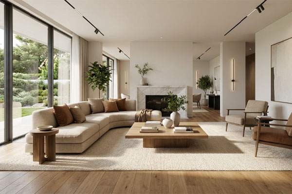
Your furniture should never blend perfectly into the floor, as this creates a “monochrome void” where nothing stands out. When deciding how to pick floor color , you must aim for a minimum of two shades of difference between the floor and your primary furniture pieces.
High contrast creates a dynamic, high-energy environment, while low contrast creates a calm, serene atmosphere. The goal is to ensure that the legs of your chairs and tables are clearly visible against the ground.
Should you use high contrast?
High contrast, such as dark espresso furniture on a light maple floor, creates a very defined and sophisticated look. This is a favorite in corporate boardrooms and luxury retail where specific items need to be highlighted.
Here is why:
- It defines the shape of the furniture.
- It adds visual interest without extra decor.
- It makes the room feel more architectural.
Is low contrast ever better?
Low contrast is often preferred in healthcare or wellness spaces where the goal is to reduce visual stimulation. Using a medium-oak floor with teak or walnut furniture creates a soft, blended transition that feels natural and grounded.
| Furniture Color | Ideal Floor Color | Style Vibe |
|---|---|---|
| Dark Wood | Light Grey / Blonde | High Contrast / Modern |
| White / Glass | Medium Oak / Stone | Clean / Scandinavian |
| Mid-tone Wood | Dark Walnut / Slate | Executive / Classic |
Furniture legs act as the transition point between the vertical and horizontal planes.
Key Takeaway: Avoid matching your floor color exactly to your furniture; instead, select a shade that is either significantly lighter or darker to provide necessary visual separation.
When should you use trends in how to pick floor color?
Following trends can be dangerous for B2B applications because flooring is an expensive asset to replace. When you evaluate how to pick floor color, you should distinguish between “fast fashion” colors and “stable market” trends that hold their value over time.
Currently, the industry is moving away from the “cool grey” era and toward “warmer neutrals” and “biophilic” designs. Staying slightly ahead of the curve ensures your property remains modern for the duration of its lease or life cycle.
What are the current timeless trends?
The rise of “Greige” (a mix of grey and beige) has become a staple because it bridges the gap between warm and cool interiors. This versatility makes it a safe bet for property developers who don’t know who the end user will be.
Think about it:
- Natural Oak: Never goes out of style.
- Matte Finishes: More popular than high-gloss for a modern look.
- Wide Planks: Make rooms look more premium and less cluttered.
Why avoid hyper-trendy colors?
Colors like black or extremely whitewashed floors are highly polarizing and can show every speck of dust or hair. While they look great in photography, they often fail the “usability” test in high-traffic commercial environments.
| Trend Type | Example Colors | Longevity Rating |
|---|---|---|
| Timeless | Natural Oak, Honey | Very High |
| Emerging | Greige, Warm Ash | High |
| Niche | Jet Black, Bright White | Low |
Trends should inform your decision but never dictate it entirely at the expense of functionality.
Key Takeaway: Focus on “stable” trends like warm-toned neutrals and wide planks to ensure your space looks contemporary without becoming dated in five years.
Why does wall paint dictate how to pick floor color?
Walls occupy the largest vertical surface area in a room, meaning they will always be in your peripheral vision alongside the floor. When you are learning how to pick floor color , you must consider the “60-30-10” rule of design: 60% dominant color (walls), 30% secondary (floor), and 10% accent.
If the walls and floor are too similar in tone and value, the room loses its three-dimensional quality and feels like a box. A professional design creates a clear distinction between the horizontal and vertical planes.
How do you match with dark walls?
If you have dark accent walls or deep-toned paint, a lighter floor is usually necessary to prevent the room from feeling like a cave. The floor acts as a light reflector, bouncing illumination back up onto the dark vertical surfaces.
The bottom line:
- Navy walls + Light Grey floor: Classic.
- Forest Green + Natural Oak: Organic.
- Charcoal + White Stone: Ultra-modern.
What works with white walls?
White walls are a blank canvas, but they can feel sterile if paired with a floor that is also very light or clinical. A medium-toned wood or stone floor adds the “soul” and texture that white walls lack, making the space feel finished rather than unfinished.
| Wall Color | Floor Color Recommendation | Goal |
|---|---|---|
| Off-White | Medium Brown / Oak | Add warmth/texture |
| Deep Grey | Pale Blonde / Ash | Create contrast/light |
| Warm Beige | Dark Espresso | Sophistication |
Walls and floors must work in a “push and pull” relationship to create depth.
Key Takeaway: Use your floor to balance your wall color; if the walls are dark, go light on the floor, and if the walls are light, add depth with a medium or dark floor.
What architectural styles guide how to pick floor color?
The bones of your building often provide the best clues for how to pick floor color. A sleek, glass-fronted modern office requires a different foundation than a renovated industrial loft with exposed brick and ductwork.
Ignoring the architecture often results in a “forced” look that feels disconnected from the building’s identity. Respecting the era and style of the space leads to a more authentic and valuable interior.
What is the Industrial / Loft style?
Industrial spaces often feature “hard” materials like concrete, brick, and metal. To complement this, floors should either lean into the aesthetic with grey stone-look planks or provide a “soft” counterpoint with rustic, reclaimed wood textures.
Consider these options:
- Weathered Grey: Matches metal and concrete.
- Deep Amber: Provides warmth against cold brick.
- Distressed Texture: Hides scratches in busy environments.
What is the Modern / Minimalist style?
Minimalist design thrives on lack of clutter and clean lines. For these spaces, floors with very little grain variation and a matte finish are ideal, as they provide a smooth, continuous visual surface that doesn’t distract the eye.
| Architectural Style | Ideal Floor | Key Characteristics |
|---|---|---|
| Scandinavian | Light Oak / White | Airy, Natural, Clean |
| Mid-Century | Teak / Walnut | Warm, Vintage, Rich |
| Industrial | Concrete / Grey Oak | Raw, Urban, Edgy |
Architecture sets the stage, and the floor color is the primary backdrop.
Key Takeaway: Align your color choice with the architectural DNA of the building to create a sense of cohesion and structural integrity.
How do maintenance needs change how to pick floor color?
In B2B environments, the “cleanability” of a surface is just as important as its aesthetic, which is a major factor in how to pick floor color . Very light and very dark floors are notoriously difficult to maintain in high-traffic areas.
A jet-black floor will show every white footprint and speck of dust, while a pure white floor will highlight every dark hair or scuff mark. For commercial longevity, the “middle ground” is the most strategic choice.
Why are mid-tones the gold standard?
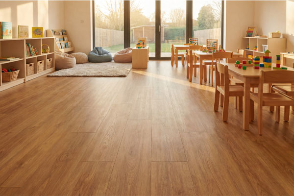
Medium-toned floors with a “varied” grain or pattern are the best at hiding daily wear and tear. This is why you see honey-oak or multi-toned grey floors in busy lobbies and retail chains—they look clean even when they aren’t.
Here is the deal:
- Hide dust: Medium greys and tans are best.
- Hide scratches: Grained patterns mask surface imperfections.
- Hide mud: Brownish-grey (Taupe) is superior.
Are certain colors better for pets or shoes?
If the space expects heavy foot traffic or is pet-friendly, avoiding high-gloss finishes and solid colors is essential. A matte, textured floor in a medium-brown tone will disguise the micro-scratches caused by grit and debris brought in from the outdoors.
| Color Category | Maintenance Level | Visibility of Dirt |
|---|---|---|
| Very Light | High | High (Dark dirt) |
| Very Dark | High | High (Dust/Scratches) |
| Mid-Tones | Low | Low (Masks both) |
Maintenance-informed color selection reduces long-term operational costs for facilities management.
Key Takeaway: For high-traffic areas, choose a mid-toned color with a visible grain or pattern to hide debris and minimize the appearance of wear.
Which ceiling heights influence how to pick floor color?
Vertical volume changes the way color “settles” in a room, impacting how to pick floor color for different floors of a building. Low ceilings can feel oppressive if the floor is too dark, creating a “sandwich” effect that makes the space feel shorter.
Conversely, very high ceilings in cathedrals or modern foyers can handle—and often require—darker floors to make the ground level feel accessible and human-scaled.
How do you handle low ceilings?
To “lift” a low ceiling, you should pair a light floor with light walls and a white ceiling. This lack of visual breaks allows the eye to travel upward without being stopped by a dark horizontal plane at the bottom.
Look at the facts:
- Vertical flow: Light floors + Light walls.
- Horizontal break: Dark floors + Light walls (makes room feel wider but shorter).
- Continuity: Keeping the same color through multiple rooms reduces visual “stops.”
What about “Grand” spaces?
In spaces with double-height ceilings, a light floor can sometimes make the room feel hollow or echoing. Using a rich, dark color helps “warm up” the massive volume of air and gives the room a sophisticated, grounded foundation.
| Ceiling Height | Strategy | Recommended Floor |
|---|---|---|
| Low (< 8ft) | Reflect & Lift | Pale Ash / Birch |
| Standard (9ft) | Balanced | Any Mid-tone |
| High (> 12ft) | Ground & Anchor | Espresso / Dark Slate |
The distance between the floor and the ceiling determines the “visual pressure” of the room.
Key Takeaway: Match your floor color to the vertical scale of the room—light colors for low ceilings to create air, and dark colors for high ceilings to provide a sense of scale.
Where can samples help with how to pick floor color?
Digital renderings are never a substitute for physical samples when you decide how to pick floor color . Screen calibrations vary wildly, and the way a material absorbs light in a laboratory photo is different from how it will look in your specific construction site.
Procurring large-format samples and placing them in the actual environment is the only way to verify the color-match against other finishes. This step prevents costly “change orders” during the installation phase.
How should you test samples?
Place your samples on the floor against the baseboards and leave them there for 24 hours. This allows you to see how the color interacts with morning, afternoon, and evening light, as well as the transition to artificial lighting at night.
Think about it:
- Vertical vs. Horizontal: Always lay the sample flat on the floor.
- Side-by-side: Compare it directly against your wall paint swatches.
- Multi-piece: Look at at least three planks to see the “grain variation.”
Why does sample size matter?
A small 2-inch swatch is insufficient to see the true character of a floor. For B2B projects, you should request “full-plank” samples to understand the pattern repeat and the true scale of the color variation across the surface.
| Testing Method | Benefit | Professional Grade? |
|---|---|---|
| Digital App | Quick visualization | No (Preliminary only) |
| Small Swatch | Basic color check | Low |
| Full Plank | True color & pattern | Yes (Mandatory) |
Physical verification is the final safeguard in the procurement process.
Key Takeaway: Never commit to a bulk flooring order without testing full-sized samples in the actual room’s lighting to ensure the undertones and values meet your expectations.
Conclusion
Picking the perfect floor color is a strategic decision that balances architectural constraints with aesthetic goals. By addressing lighting, room volume, and undertones, you solve the fundamental problem of visual disharmony that plagues many professional projects. Whether you are aiming for the expansive feel of a light-filled studio or the prestigious weight of a dark-toned executive suite, your choice of foundation dictates the success of the entire interior.
As we look toward the future of sustainable and resilient design, the floor remains the most significant surface in any building’s lifecycle. We invite you to explore the possibilities of precision-engineered flooring that combines durability with world-class aesthetics. To find the ideal match for your next project, contact us today for a professional consultation and custom samples.
FAQ
Can I use different floor colors in different rooms?Yes, but you should maintain a consistent undertone to ensure the transition between spaces feels intentional rather than accidental. In professional settings, it is best to use a “transition strip” or a change in plank direction to signal the shift in color, ensuring that the visual flow remains cohesive throughout the building.
What is the best floor color for hiding scratches?Mid-toned woods with a matte finish and a visible grain are the best options because they naturally disguise surface imperfections. Dark, high-gloss floors are the most difficult to maintain in this regard, as they act like a mirror that reflects every minor scuff or scratch in the light.
How do I know if my floor color is too dark?If you find yourself needing to turn on lights during the day in a room with windows, your floor may be absorbing too much of the available natural light. A floor that is too dark for its environment will make the walls feel like they are closing in, creating a “heavy” atmosphere that can negatively impact productivity or mood.
What is the best floor color for a modern minimalist office?Light grey or pale “greige” with minimal grain variation is the gold standard for minimalist design because it provides a clean, neutral backdrop. These colors reflect maximum light and allow the sleek lines of modern office furniture and technology to stand out without visual competition from the floor.
How do I know if my floor color matches my walls?You should aim for a “complementary” relationship where the floor and walls are separated by at least two shades of lightness or darkness. If you hold a sample against the wall and it “disappears” or looks muddy, the lack of contrast will likely make the room feel flat and uninspired once fully installed.